Hospitals can intimidate, evoking feelings of stress, fear and even helplessness in patients and their loved ones. These emotions are compounded when people feel lost and disoriented by the hospital’s sometimes confusing web of corridors, floors, elevators, stairwells and departments.
Enhanced wayfinding tools can help relieve that anxiety by bolstering a sense of control in patients. When patients can successfully navigate the facility, they feel more confident and less stressed. That, in turn, can improve patient experiences — and outcomes. Here’s how to improve wayfinding in hospitals to achieve that goal.
1. Let color coding tell the story
Color coding at hospitals, in conjunction with signage, helps orient those visiting the facility, be they patients, family members or outside clinicians. For example, distinctive orange walls on the third floor can be more memorable than the floor number itself — especially if that color is used for the third floor in all the mapping and signage. The same holds true for distinct patterns, including geometric shapes.
Colors, along with clear signage, can also direct people away from areas where they don’t belong, such as radiology or the burn unit. Furthermore, colors and designs create a psychological and emotional impact, which can be to the hospital’s advantage by soothing and brightening the mood of patients, visitors and caregivers.
2. Create memorable landmarks
Landmarks orient people, and the more memorable they are, the better, as with these common ones:
- A digital display, for example, The Wall All-in-One by Samsung, creates a striking landmark that helps patients and visitors get their bearings before moving forward. Because the display provides excellent visibility in various lighting conditions, it is hard to miss.
- Works of art can be powerful landmarks while also contributing to a sense of well-being. Consider the bear statues at Children’s Nebraska. They help orient families as they move through the facility, while also generating joy and delight at what can be a very scary time for patients and their families.
- Nature works similarly. Interior green spaces can serve as landmarks, and research shows that they not only aid navigation but can improve the patient’s navigational experience. That same research shows that bringing nature into large hospitals can reduce the stress of patients, visitors, staff and providers.
3. Offer guidance at critical decision points
The placement of digital wayfinding tools in hospitals is almost as important as the tools themselves. Interactive displays, maps and other signage should be located at key decision points, especially near entrances, elevators, intersections and wherever a patient or visitor needs to make a decision.
Improve patient outcomes and facility resilience
Boost operations, streamline communication and enable staff to enhance the overall patient experience. Download Now
For example, at one major children’s hospital, Samsung displays with touchscreen overlays provide interactive wayfinding and directory guidance at key points, including the elevator banks. This lets patients and other guests get their own customized directions when and where they need them.
4. Streamline check-in with hospital kiosks
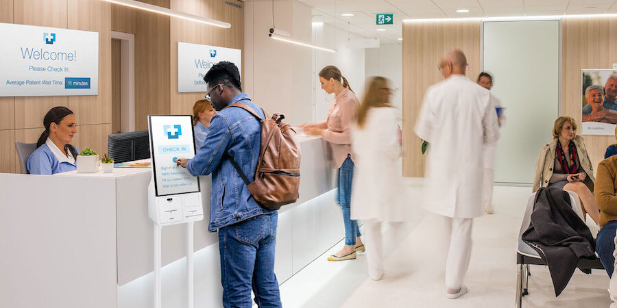
Long lines at check-in are particularly frustrating, especially if for a procedure you are already anxious about. Self-service kiosks, such as Samsung Kiosk, in lobbies or waiting rooms give patients the option to easily check themselves in and move forward, rather than just worrying and wondering in a waiting area. They may also include interactive maps that show the patient how to find their destination, adding a sense of empowerment and direction.
5. Leverage interactive maps and apps
Interactive maps can interact with hospital and wayfinding apps, while still offering an intuitive navigation tool for those who don’t use them. Digital map kiosks, interactive displays and interactive signs, such as those at Mercy Health in Cincinnati, work in concert with wayfinding apps to help patients and visitors navigate the hospital.
Importantly, digital maps can be regularly updated to reflect any changes in the hospital layout, such as detours, new wings and temporarily closed sections, ensuring everyone has access to accurate, up-to-date information. These updates can appear on the maps and kiosks and on the smartphone screens of those who have the hospital app. And, in the event of a regional or national emergency, these systems can send alerts out immediately, keeping everyone informed.
Meet patients where they are
Not all patients are the same, and many have specialized needs, so wayfinding needs to employ a variety of digital tools and be clear, friendly and flexible, accommodating different languages, audio-visual impairments, age groups and other characteristics. A combination of digital and traditional media, along with options like voice guidance, ensures that wayfinding is accessible to all.
This ultimately enhances the patient journey, fostering a more positive and less stressful hospital experience. At the same time, it reduces the burden on staff, freeing them up for more urgent tasks. Wayfinding that incorporates hospital wayfinding best practices, innovative design and digital solutions serves them all.
Learn more about how healthcare digital signage is transforming hospitals for the better. Also, download this free white paper to discover how Samsung is helping to create the patient room of the future today.
