Digital technologies have prompted bankers to start changing the ways their branches look and work, evolving in a similar way to the retail shops of malls and Main Street. Banks used to be all about half-walls, counters, windows and wickets.
But with a lot of traditional banking activities now occurring on desktops and mobile devices, or at ATMs in branch lobbies, modern bank design uses welcoming, open concept layouts and intelligent display solutions to drive experience and objectives.
Instead of brochures at counters and closed-door meetings, customer communication and education is happening through tools like video walls, smart displays and digital signage with content management systems. Visually appealing, dynamic and targeted messaging is a powerful way to get customers talking and acting on bank services like loans and financial planning — things that don’t always come across on a PC screen, tablet or smartphone.
That need to connect and reinforce the broad range of financial services available drove a digitally focused branch transformation process at Mountain America Credit Union, a 90-year-old financial organization with branches from Utah down to New Mexico and Arizona.
“We committed to redesigning our branches to remove the barriers between us and our members,” says Jeremy Nelson, Mountain America’s vice president of direct marketing. “We wanted an open and inviting branch without the partitioned teller booths. We wanted open areas where our employees can sit down and work with members on their financial needs. And we needed something that made a strong visual impact on members from the moment they walked through our front doors.”
First Impressions
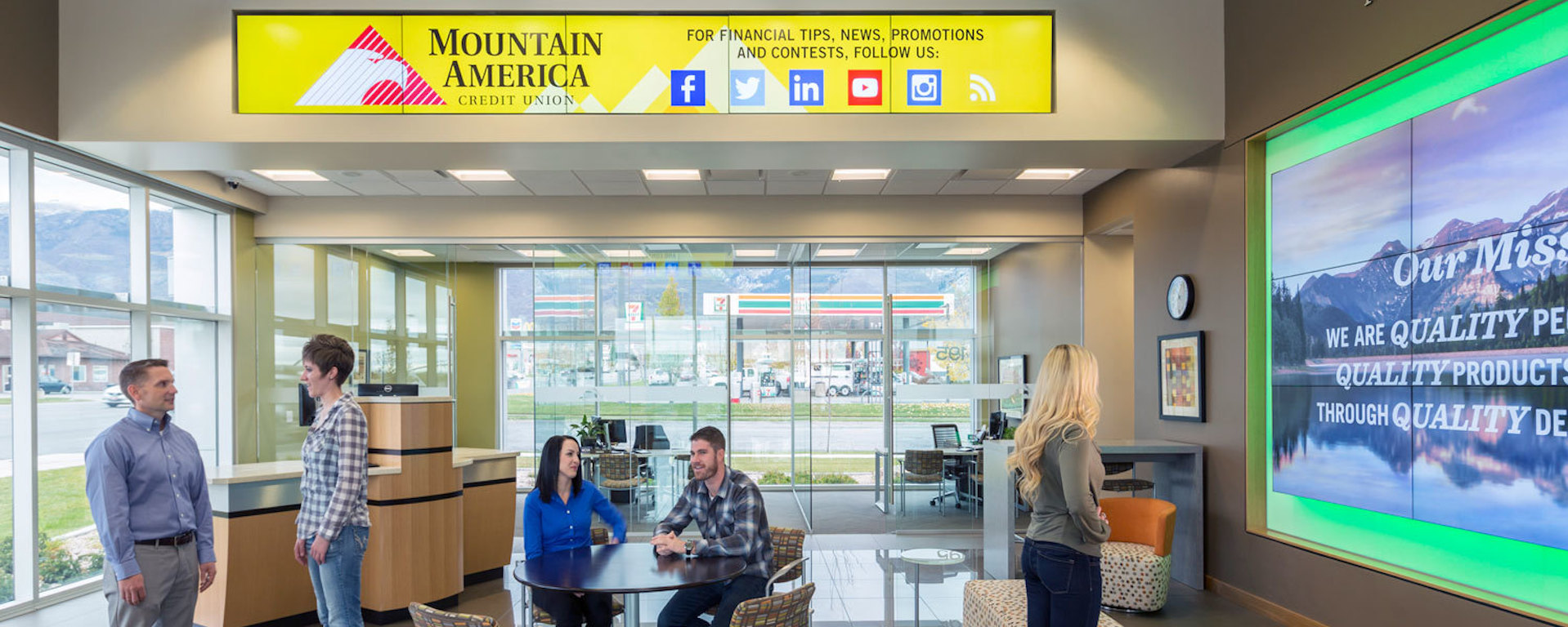
Few things create an impact like the big visual pop of clustered monitors filling a wall or other architectural features in a designed space like a bank. When customers walk into a modernized Mountain America branch, the first visual impression they get is a nearly seamless video wall made up of nine Samsung UD Series 55-inch displays, stacked three high and wide. The huge feature wall has halo lighting around its edges, with complementary colors changing in sync with the on-screen content.
The digital modern bank design, put together by Utah-based solutions company RevelTV, uses high-brightness displays that are visible from the street both night and day. “We set out to create a video wall solution that would help Mountain America make an enormously positive impression on members as soon as they walked through their front doors,” explains Matt Dopp, RevelTV’s founder and CMO.
Transformed Mountain America branches also sport a pair of eye-catching, one-by-five tiled video display walls that are embedded in structural bulkheads, put there to drive program promotions and reinforce the brand. A 65-inch screen is also embedded in a wall in the entry area, set at eye level to drive promotions, products and financial information.
Samsung’s Smart Signage displays, which have media players incorporated into the display enclosures, remove the need for external media players, reducing the physical footprint of the hardware. That makes it easier for architects and system integrators to seamlessly build these digital display features into modernized branch designs.
Lasting Benefits
All the Mountain America programming is custom-developed to suit the branch environment and dynamics, and both video and audio can be synced across all three video wall displays to create visually dominant messages.
Nelson says the capital and operating investment in digital is paying off, with programming on screens triggering questions and conversations about complex and strategic services like retirement planning, college savings and wealth management. For customers who rely heavily on mobile and online banking, these are topics that might otherwise never come up.
“We think of the branch transformation from not just a return on investment perspective, but also a return on experience perspective,” says Nelson. “Instead of seeing imposing counters and long lines, our members now see an inviting, open branch with modern digital signage that clearly sets us apart from a traditional branch.”
Read the case study to learn how Mountain America redesigned its branches with the addition of digital signage.
Mountain America Credit Union Transforms Branch Banking Experience with Digital Signage from Samsung Business USA
