Hospitals can be overwhelming for sick patients and their families. With winding hallways, wings that only connect via tunnels and elevators that can only reach certain floors, the modern medical complex can seem more like a maze than a healthcare facility.
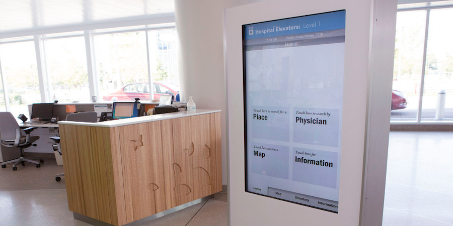
Healthcare providers know they have a design problem, and that confusing layouts and poorly executed signage increase patients’ anxiety during an already stressful situation. So to ensure visitors get all the information they need and get where they need to go, forward-thinking healthcare providers are investing in digital signage with touchscreen wayfinding capabilities.
Bridging communication gaps to improve the patient experience
Nearly 70 percent of healthcare organizations rank patient experience as their first or second priority. As for how they plan to enhance the patient experience, a top answer is patient-centered communication.
Poor patient experience can also affect hospitals’ bottom line. In the Hospital Consumer Assessment of Healthcare Providers and Systems (HCAHPS) survey, those who scored “excellent” had a net margin of 4.7 percent, while those who scored “low” had a net margin of 1.8 percent.
Reimagine healthcare facility design — brilliantly
Discover how digital displays can empower caregivers, engage patients, and elevate health brands. Download Now
Yet, increased communication often leads to more design problems for a large, modern medical complex. In addition to walking directions, healthcare providers must display information about patient safety, workplace safety, wellness awareness, mass emergencies and hospital security policies. Posting all this information on bulletin boards, along hallways or on elevator walls creates clutter that only adds to the confusion and can quickly become outdated.
The solution is to streamline communication by using hospital digital signage that presents information in a clear, organized manner. The digital signage has to be reliable and energy-efficient, blend with the hospital’s decor and comply with standards set forth by the Americans with Disabilities Act (ADA) and the Health Insurance Portability and Accountability Act (HIPAA). For example, the ADA requires that objects hanging from a wall protrude no more than four inches. In addition to meeting compliance standards, any practical solution needs to be scalable and adaptable to be used in a variety of areas throughout the hospital.
Guiding the way to a healthier future
When one of the nation’s largest children’s hospitals built an innovative new medical complex, leaders looked for a more efficient way to communicate up-to-date information to patients, visitors and staff. Traditional printed fliers, posters and maps weren’t viable options in such a massive building. And the clutter would distract from the warm and modern atmosphere they wanted to create.
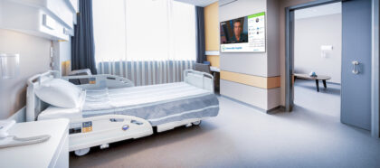
Hospital leaders decided to install more than a hundred Samsung commercial large-format displays throughout the entire medical complex. The children’s hospital can now easily display targeted communications and real-time alerts to patients, families and employees throughout the hospital or in individual departments. In hallways and lobbies, visitors can access interactive wayfinding touch-screen kiosks for easy-to-read maps and directions. Even the hospital cafeteria features digital menu boards with meal schedules and nutritional information.
“This new approach was an important part of the overall patient experience,” says Andy Shevak, general manager of ASI Signage Innovations, which installed the digital signage system in the hospital. “It offers a structured and reliable way to get branded information to patients, their families and staff. And post-installation surveys show that families and staff are reading them and using them for wayfinding information.”
See how your healthcare organization can deliver a better patient experience with innovative healthcare displays. And download the full case study of how one hospital improved their patient communications with Samsung digital signage.


