We are blessed, and in many ways overwhelmed, by countless choices when it comes to what we want to buy and how we purchase and receive those things.
The incredible rise of one-stop-shopping e-commerce platforms like Amazon means going to a physical store to shop is seemingly not something we even need to do anymore. A few clicks, and almost anything we might need is delivered to our home or office desk — sometimes the same day.
But we still physically shop, and even “e-tailing” giants like Amazon are opening physical stores for a variety of reasons. Retail is not dying — but it is certainly evolving.
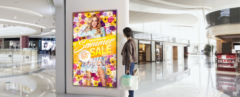
Those brick and mortar retailers that are surviving and thriving are squarely focused on one key attribute of effective retailing: the customer experience. Display technology, such as digital posters, window displays, video walls and interactive stations, are increasingly central to delivering the experience shoppers want to have in physical stores, especially as they continue to deal with the COVID-19 pandemic.
Delivering an experience
Customer experience in retail can be described and interpreted in any number of ways, but it really comes down to the following:
- Autonomy: Shoppers sometimes want to be left alone to make orders, perform product look-ups and check out, but they also like to have assistance available if they need it.
- Ambiance: They want stores that are more than just stocked showrooms. They want experiences.
- Services: They expect certain things that were once amenities to now be standard — such as Wi-Fi and newer, more flexible payment methods like mobile POS.
- Friction-free: Shoppers want quick and easy access to information and the “buy” button. Great website design means no information or action is more than three mouse clicks away. Consumers conditioned to that experience expect the same sort of frictionless navigation when shopping in stores.
- Smart: Shoppers want stores to be optimized for them both in the way they’re designed and how information is made available or delivered.
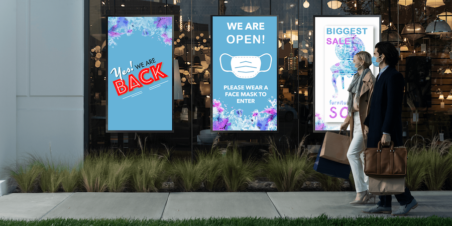
- Safety: As a result of the COVID-19 pandemic, consumers want to feel safe when shopping in stores and trust that the retailer has their safety in mind.
The right display for each situation
So how do digital signage and interactive display technologies drive experience? By helping deliver all of the above attributes.
Let’s take autonomy as an example. Retail research found 95 percent of customers prefer to be left alone as they shop. Almost as many said they’d even prefer to do their own price checks, as opposed to asking store staff. The clear message: they don’t like being “sold” to and pressured to make purchases.
Improve store safety with digital signage
Discover new ways you can adapt your store signage to keep shoppers safe and maximize ROI. Download Now
But shoppers often do have questions, and interactive displays positioned strategically around a store can provide valuable information and help convert browsers into buyers while maintaining the autonomy that people crave.
That shows up in different ways around stores — owing a lot to what the store sells, how it works and its overall style and physical footprint.
Wireless carriers use touchscreen displays to help consumers find and narrow their options for plans, which are steadily evolving. That’s particularly helpful because these kinds of stores often have more customers than available associates, and sales and activations can take a long time. Touchscreens can answer questions even when staff members are busy — and because plans and offers change so often, a well-managed touchscreen system has the most correct and current information. Kiosks, for example, even offer retailers the flexibility of allowing customers to make an order and complete a transaction on their own time, which eliminates the need for face-to-face interaction with associates entirely.
In a large-footprint store, digital directories help locate products amid all the aisles, highlight special offers, and often double as price-checkers and inventory look-up tools.
At the opposite end of size, retailers as diverse as automotive and beauty brands are shrinking store sizes in high-rent districts like city centers to lower operating costs but still access consumers in attractive locations. Automakers are using large video walls and touchscreens to help shoppers configure vehicles and view them at life-size, while cosmetic companies are using in-aisle touchscreens to allow shoppers to look over the full “endless aisle” of products.
Thoughtful displays
The first generation of stores investing in digital signage often did so with the mindset that technology demonstrated the retail brand’s commitment to innovation. Sometimes, there were displays where they weren’t needed or screens that perhaps were in the right spot but running ineffective or outdated content.
These days, retailers are much more thoughtful and strategic about where displays are placed. The data from retail software providers paired with displays is helping retailers know where consumers are spending time inside the store so they can readjust products or signage accordingly to maximize sales.
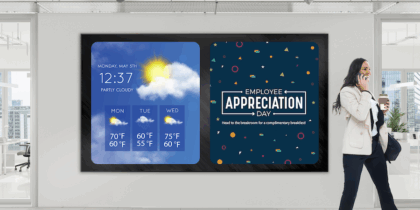
For example, a digital poster at an entry area makes shoppers aware of new products and specials. Screens at key areas like featured merchandising positions and end-caps promote specific items. Larger displays accent and highlight store sections, particularly in image-conscious retail settings like fashion. Video walls behind reception drive loyalty programs and reflect shopper sentiment and excitement through curated social media posts. With content management systems (CMS) like Samsung’s MagicINFO, it’s easy for retailers to create imagery playlists and update the displays at a moment’s notice whenever there is a new promotion going on.
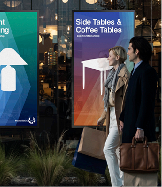
High-brightness displays in windows are used to convert passersby into shoppers through call-to-action messaging. Samsung now has a very clever dual-sided display solution that puts screens back-to-back on an impossibly thin totem, with a super-bright screen facing outside that cuts through glare and a second screen facing into the store, running separate messaging. It makes the most of a highly-prized visual space.
Setting the mood
A macro trend we’re seeing develop in commercial property and retail is using direct view LED as architectural design elements. In the old days — like a couple of years ago — stores put video walls of various sizes on feature walls to dress up the store and drive brand messaging.
Now, architects and retail designers are thinking of LED as a wall covering, a ceiling or even a floor. The modular nature of LED displays is that they can be shaped and sized to fit a need, even being formed in gentle curves as space demands.
Fine-pitch versions of direct view LED products result in visuals that can look good at relatively close quarters, but with none of the seams or restricted dimensions of flat panel displays.
Most exciting, products such as Samsung’s microLED-driven The Wall produce high resolution, vivid visuals that rival premium flat panel displays at whatever size is necessary for the store design.
Designing and delivering amazing in-store visual experiences makes a statement about the store and its point of view. Done well, it makes shoppers feel positive about being there and makes them want to return.
Digital for the win
Digital signage and interactive displays seal the business argument when they drive experience and solve problems. Sometimes, the signage is grand, like a vast video wall. Other times, it’s far more subtle, like a small shelf-edge display or navigational screen.
What’s common? Digital signage is now everywhere. Just take a look around the next time you hit the mall or high street.
Get your free guide to the what, where and how of digital signage in retail environments. From interactive kiosks to outdoor-ready displays to eye-popping video walls, explore Samsung’s full range of groundbreaking retail digital signage.


