Developing mobile experiences that can facilitate conversations between human beings and virtual assistants may not be child’s play, but Sangmok Han has decided there are some surprising parallels between Bixby capsules and Lego.
The engineering manager for Bixby Views at Viv Labs/Samsung Electronics led a session at this week’s Samsung Developer Conference (SDC) in which he walked through three different versions of a user interface (UI) his team had made for a particular Bixby capsule.
Building the building blocks
Version one, he said, was based on large chunks of code with few parameters — kind of like the bulky Duplo blocks Lego makes for toddlers.
“It was not very flexible, but when it worked, it was usable,” he said.
What's the Best Phone for Your Business?
Discover the smartphone most tailored to your business needs. Download Now
The second version of the UI, on the other hand, was more like a series of Lego bricks crushed into small piles of plastic dust. The code could work all manner of colors and pixel sizes, but wasn’t consistently usable for the capsule’s needs. It took the final version to create something that came together like an image of a Lego race car Han showed on screen. This was a UI that achieved the balance of flexibility and usability that Bixby capsules require.
Han said Samsung recognizes that most of those developing for Bixby won’t want to go through these kinds of struggles, which is why the company has enhanced Bixby Views and added Bixby Templates to make capsules — particularly the visual elements that show the results of Bixby responding to a command — much easier to develop. The resulting templates are available in the Bixby Developers Center.
Capsules from an information graph
Bixby Templates were demoed onstage during the opening keynote of SDC 2019, where Adam Cheyer, Samsung vice president of research and development and cofounder of Viv Labs, said developers will not only be able to choose templates like Bixby quiz or fact-finding capsules, but more bespoke capsules based on an information graph template.
Using only two tables, for instance — one of them listing basketball teams with names, home arenas and logos, and the other with team schedules and “away” dates — Cheyer was instantly able to generate a capsule where someone could ask Bixby what games were playing in Los Angeles on a given date.
“With this, you can create a capsule from any table filled with data, ” Cheyer said. While the basketball capsule was a consumer-oriented example, it’s not hard to see how an enterprise could do something similar with tables containing product names, steps in a business workflow or common human resources requests.
Making Bixby capsules easy to discover
Bixby is already used by business professionals today, but primarily on an individual level to manage their inboxes, calendars or to look up a client name in their contacts. With the introduction of the Bixby marketplace earlier this year, however, there will be many more opportunities to not only develop a wider range of capsules more easily, but to also find them more easily.
According to Larry Heck, Samsung’s head of Bixby North America and the CEO of Viv Labs, Bixby Developer Studio is also adding natural language categories. This means Bixby can suggest capsules based on a particular category — like Lyft when a user asks to find a ride-sharing app — and then remember their choices.
“You can have Bixby ask every time, or set a default preference for future requests,” he said. “Or you can always select ‘I need an Uber’ for a different one [than the default].”
Some of the businesses developing Bixby apps today include restaurants, hotels and retail organizations, Heck said.
How to build a successful Bixby app
Whatever kind of capsules they create, Han said developers should remember the three main elements all capsule UIs tend to contain: a dialogue area where the text of a question is shown back to the user, a content area that shows them the information they want and what he called a “conversation driver.”
If someone asks Bixby to check the weather, for instance, the conversation driver might be a list of filters or ways to refine the information in the content area like “wind speed” and “temperature.”
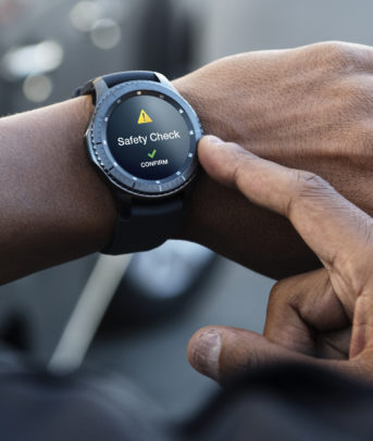
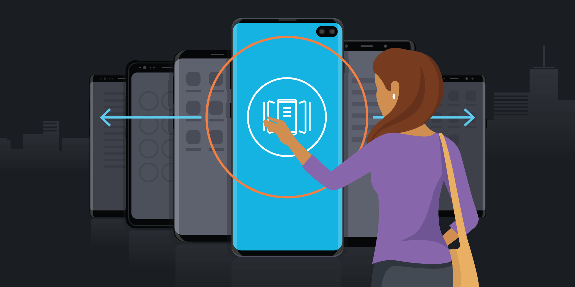
Developers also need to think about how to render Bixby apps across devices. While some Bixby capsules might need to be accessed from a TV or a fridge, capsules for more business-oriented use cases might also need to be available on a wearable like a smartwatch.
Bixby Developer Studio has made this easier by making separate layouts available to optimize for specific form factors. Bixby Developer Studio’s search feature, meanwhile, can bring up screenshots and code snippets to help simulate how a capsule will work on other devices, Han said.
“Your UI should just deliver what users need,” Han added. “The end result should always be the most relevant content, based on users’ utterance.”
Discover other applications that help build your successful mobile workspace. Find new ways to maximize your mobile value in this free white paper.